
Description: This required field should be a one or two word description of what is being asked for. This should be unique within the scope of an individual form. If you have a question about a home phone number and another about a work phone number the description should not be “Phone” for both of them. (example. Work Phone)
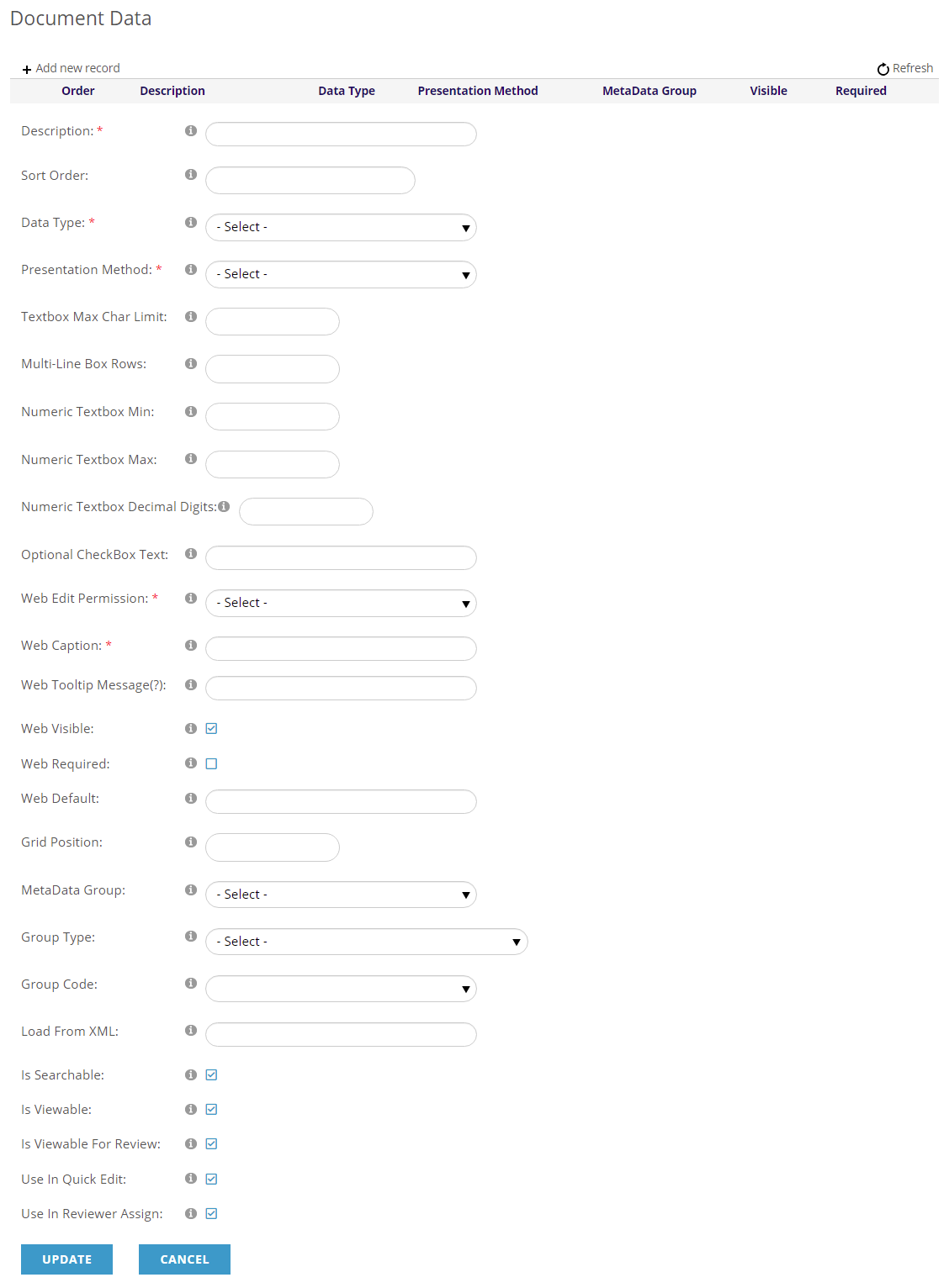
Sort Order: This is a number that will dictate the order of how questions will be displayed within the form. If there will not be 20 or questions I suggest using 2 digit numbers starting the numbering with 05 and incrementing each question by 05 (05, 10, 15, 20, 25, 30, 35….95). For more questions I suggest using 3 digit numbers starting the numbering with 005 and incrementing each question by 05 (005, 010, 015, 020, 025, 030, 035….095, 100, 105…). This method allows for additional questions to be added without the need for renumbering each question. (example. 005)
Data Type: This is a required field to indicate the type of data that is expected while answering the question. For the most part this will be String, however there are data types to specify those answers that are not String or specific types of strings.
These are the options: those marked with * are not common
- String A small amount of text
- Large Plain Text A larger amount of text
- Large HTML Text A larger amount of text which can contain HTML
- Hyperlink Text representing a website address (URL)
- Email Text representing an email address
- Integer A numeric value represented in 32 bits.
- Long* A numeric value represented in 64 bits.
- Decimal A numeric value with decimal places
- Currency A numeric value representing a monetary amount
- Boolean A binary value representing On/Off or True/False
- Date An alphanumeric value representing a date
- Time An alphanumeric value representing a time
- Single* A single precision floating point format value
- Double* A double precision floating point format value
Presentation Method: This is a required field to indicate how the request for an answer will be displayed. This will take the form of either a blank space to fill in or a method of selecting a predefined response.
These are the options:
- Textbox Open text
- Date Open text
- Time of Day Open text
- Check box: True/False Single select
- Check box List Predefined, Multiple select
- Radio 2-button List Predefined, Single select
- Radio Button List Predefined, Single select
- Multi-line Textbox Open text
- NOAH CMS Editor Open text
- Drop Down List, 1 choice Predefined, Multiple select
- Drop Down List, 2 choices Predefined, Multiple select
- Drop Down List, 3 choices Predefined, Multiple select
- Drop Down List, 4 choices Predefined, Multiple select
- Drop Down List, 5 choices Predefined, Multiple select
- Drop Down List, 6 choices Predefined, Multiple select
- Drop Down List, 7 choices Predefined, Multiple select
- Check box Single select
- Numeric Textbox Open Text
- Label Small Open Text
- Label Large Open Text
Textbox Max Char Limit: This is used to limit the amount of characters that can be entered for this response. It is suggested that you note the limitation in the on screen prompt.
Multi-Line Box Rows: This is used to indicate the size of a multi-line text box. It is not necessary as all multi-line textboxes can be stretched by dragging the lower right hand corner of the box.
Numeric Textbox Min: This will only apply to Numeric Textboxes. It is used to indicate the lowest numeric value that can be entered. If you want the user to enter a number from 1 to 5 to indicate their answer, you would set this to “1”. If the user enters a “0” or any negative number, that answer will be changed to “1”.
Numeric Textbox Max: This will only apply to Numeric Textboxes. It is used to indicate the highest numeric value that can be entered. If you want the user to enter a number from 1 to 5 to indicate their answer, you would set this to “5”. If the user enters a value larger than “5”, the answer will be changed to “5”.
Numeric Textbox Decimal Digits: This will only apply to Numeric Textboxes. It is used to indicate the number of decimal places that can be displayed in a response. If you set this to “2” then a response of “12.249” will instead display and be recorded as “12.25”.
Optional Check Box Text: This will only apply to Check Boxes. The Text indicated here will appear after the Check Box
Web Edit Permission: This required field is used to indicate who can respond to the question. This is usually set to “Author”. The “Author” is the person who is filling in the form in order to submit it.
These are the options: those marked with * are not common
- Everyone* No restrictions
- Author The one submitting the form.
- Association* Association Staff
- NOAH* JL Systems Staff
Web Caption: This required field is where you type the on-screen prompt, the question for which you are requesting a response.
Web Tooltip Message(?): The tooltip icon appears next to each question in your form, as well as each question in the form you are using now to add questions. When the user hovers over this icon a tooltip message will be displayed. This is where you create the tooltip message for each question. It is suggested that you use this message to add clarification regarding what information is being requested.
Web Visible: This check box is selected by default but can be de-selected if you wish to hide the question.
Web Required: This check box is used to indicate if the response is required. Only use this option on questions that need to be answered AND can be answered. NOTE: Do not make Label Small or Label Large fields required.
Web Default: This text will appear in the response as a default response. This is also used to assign text to a Label.
Grid Position: (1-4, or NULL) Indicates where in the Repository Grid the response will appear, if it does at all.
MetaData Group: Indicates whether this question/response is affiliated with a specific MetaData Group. This feature is used to display questions and responses in multiple tabs.
Group Type: Document item group type for indicating the location of a predefined list of responses.
Group Code: Document item group code for indicating the location of a predefined list of responses.
Load From XML: This is an alternate method for indicating predefined responses but is not commonly used.
Is Searchable: This check box is selected by default but can be de-selected if you wish to exclude the response from search options.
Is Viewable: This check box is selected by default but can be de-selected if you wish to hide the response.
Is Viewable For Review: This check box is selected by default but can be de-selected if you wish to hide the response from reviewers. This is often done to support blind judging if the response can identify the author.
Use In Quick Edit: This check box is selected by default but can be de-selected if you wish to hide the response from Quick Edit.
Use In Reviewer Assign: This check box is selected by default but can be de-selected if you wish to hide the response during the assignment of reviewers.