
The Lists area allows you to control the fields associated with Lists, like those for Opt In/Out or Demographics.
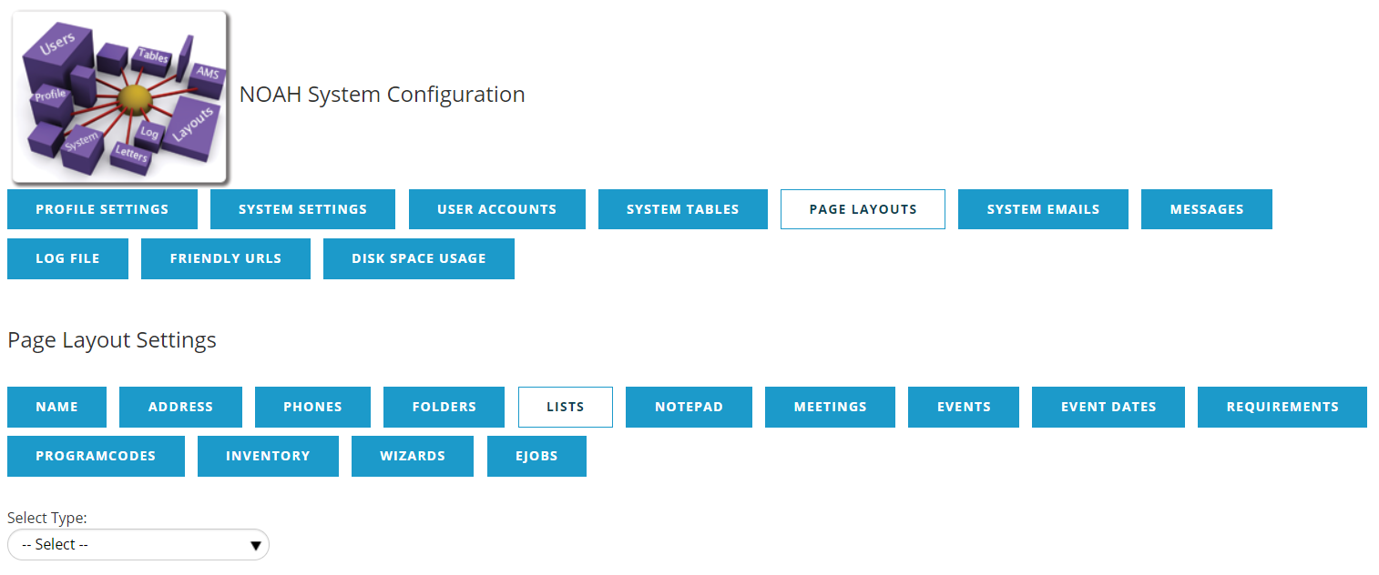
In the Select Type drop down, you can pick the specific List type you wish to edit. There is also a button to ADD LIST LAYOUTS to create more types. There is an ALL layout selection that is the default for all Lists.
Once you've selected the type you want to enter, you will see the fields available.
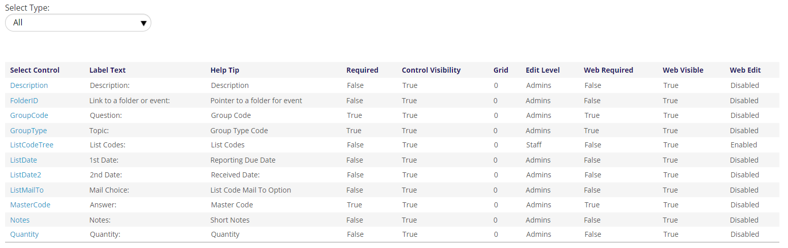
The first column is the Control Name and the other columns show a few of the control's setting. Clicking on the Control Name expands the grid to show all of the available settings.
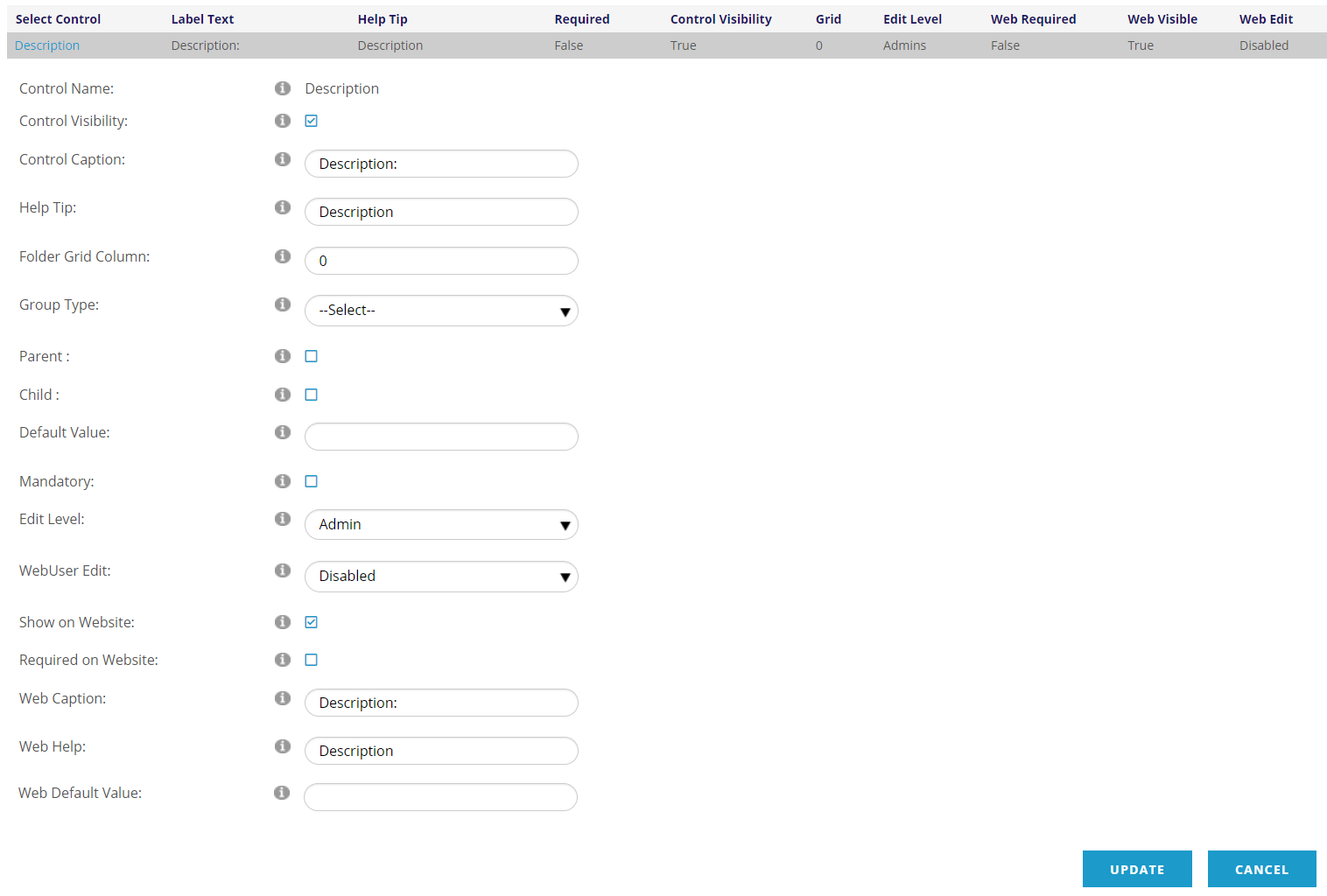
The Control Visibility checkbox determines if the control show in the screen in the AMS; when checked the field will show.
Control Caption is the label field that shows next to the text box on the form.
The Help Tip is the text that will show when a user mouses over the help icon  next to this field on the page.
The Grid/Folder Grid Column is used when this data is shown in a folder's summary table or grid. The number here show which column this data is displayed in, and zero (0) means it's not displayed.
Group Type represents the related Group Type in the Dictionary of the code to be used for the control.
Parent: If the table is flat this property doesn’t need to be set. Otherwise, if this property is checked then the Group Code that corresponds to the Group Type of the control is the parent code and is stored in field Code1 (or 2, 3, 4, 5) in the folders table and Program Codes table.
Child: If this property is checked then the Master Code that corresponds to the parent Group Code is the child code. The code is stored in the Code2 (or 3, 4, 5, 6) field in the folders table and Program Codes table. The field name number always succeeds the parent code’s number. For example if parent is Code1 then child is Code2; if parent is Code3 then child is Code4, etc.
The Default Value is what this field will default to when a new entry is added.
The Mandatory checkbox denotes is this field is required. A red asterisk (*) will be shown next to this field when it is required.
Edit Level determines who can edit this field in the AMS:
- Staff- Any staff person may update this field
- Admin- only those with the is Client Admin privileges my update this field. See User Settings for more information.
- Restricted- only certain properties of the control are editable
- NOAH- none of the properties are editable; only JL Systems staff have access.
Similarly, WebUser Edit determines who can edit this field on the website:
- Enabled- changes can be made to this field on the website
- Disabled- this field can not be edited on the website
- Restricted- only certain properties of the control are editable
- NOAH- none of the properties are editable for the web user; only JL Systems staff have access.
Show on Website and Required on Website are checked when this field should be shown on the website, and if it is required on the website. A red asterisk (*) will be shown next to this field when it is required.
Web Caption is the label field that shows next to the text box on the website.
Web Help is the text that will show when a user mouses over the help icon next to this field on the website.
Web Default Value is the default value that will be defaulted in when a new entry is added on the website.